qatsi: (meades)
Book Review: Come to Finland! Paradise calling, by Magnus Londen
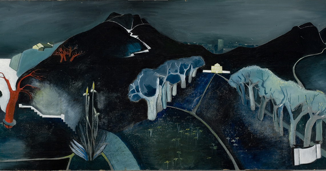
I enjoyed my visit to the Ateneum in Helsinki, and although thie pocket book relates to a previous exhibition at the National Museum of Finland I didn't see, I'm glad I picked it up in the gift shop. The written word is slightly tongue-in-cheek, but with a book like this, we're here for the pictures, which are excellent, spanning the period from the 1920s through to the 1960s, with some additional works from contemporary travel poster competitions. Some favourites below.


Harry Hudson Rodmell, 1920s


Aukusti Tuhka, 1937


This pair reminds me of M C Escher. Per-Olof Nyström, 1961


Lasse Hietala, 1960s


Come to Finland Poster Competition, Jaco & Aline Hubregtse, 2017


Come to Finland Poster Competition, Rina Kusaga, 2017

qatsi: (sewell)
We went to Oxford on Saturday to see the exhibition of America's Cool Modernism at the Ashmolean. For the most part I enjoyed it, though one or two of the more abstract pieces didn't really appeal; it was interesting to observe a variety of influences from other places, including Soviet constructivism. My favourite pieces were the architectural (such as Edward Hopper's Manhattan Bridge Loop), the industrial (Charles Sheeler's Water), Martin Lewis' spectral Which Way?, and the almost Escher-esque perspectives of Samuel Margolies' Man's Canyon and William McNulty's New York in the Fifties.

We were fortunate to time our visit to coincide with a tour of the cast collection basement, usually not open to the public. About 1000 items are stored here, even of themselves now museum pieces, as the casts no longer have the significant academic function they once did. But it was interesting to appreciate the value of the casts in allowing, for example, exercises in re-combining statues that are now in different locations but may once have been presented together.
qatsi: (sewell)
I'd missed Marie Curie: The Courage of Knowledge at Reading Film Theatre a couple of weeks ago due to illness, so I was pleased that last night I went to see Loving Vincent. The story is principally that of Armand Roulin, whose father, a postman, dispatches him, about a year after Vincent's death, to deliver a letter from Vincent to Theo van Gogh (by this time also dead). Armand travels first to Paris and then to Auvers-sur-Oise, in search of Theo's widow or another suitable recipient. In his task he meets several of the villagers who all have their own stories and recollections of Vincent, some of which cast doubt on the circumstances of his death.

But the story is only a part of the film, and probably wouldn't have drawn me on its own. What is perhaps unique about the film is that it's an animation, produced in oil painting, in the style of van Gogh. I had wondered whether this could be true - surely this could also have been done by CGI, and would have been more cost-effective - but the long list of sponsors at the start of the film, and the long list of animation artists (mostly in Poland and Greece) at the end, verifies it. The result is intensely atmospheric, and very cleverly done, as many of the characters were painted by van Gogh and are clearly based on those paintings. Like The Death of Stalin, there's no attempt to give faux-French accents to the characters, although in some of the flashbacks the voice of Vincent does seem to have a Dutch inflection. Amidst a strong cast I thought the voices and performances of Douglas Booth (Armand Roulin), Chris O'Dowd (Joseph Roulin), and John Sessions (Pere Tanguy) particularly stood out.
qatsi: (penguin)
Book Review: Poster to Poster - Railway Journeys in Art - Vol 2 Yorkshire and the North East, by Richard Furness
The book sale at work spoils me as to the price and value of books; but we also have a bonus scheme, and though it doesn't compare to that of a banker, it allows me to indulge in things I probably wouldn't have bought otherwise, such as this book. I can't really remember when I developed a liking for vintage travel posters; but most probably during the mid to late 1980s when the BBC adaptation of Miss Marple with Joan Hickson, and Granada's Poirot were in full flow. I find it interesting how many travel posters today, both for national rail services and TfL on the tube, clearly take inspiration from the "Golden Age".

Of course, I chose this volume in particular because it's the area where I grew up. The balance of posters isn't necessarily what I would have chosen, with only one chapter being devoted to Northumberland, but it is probably a more objective choice. Most of the posters are from the LNER period mid-1920s through to 1948, and the first 10-15 years of BR, although Furness highlights the GNR, and NER in particular, as also producing attractive poster art in the period before that of the "big four" operators, and includes more experimental examples and modern posters too. The text is a bit idiosyncratic in places, being a mix of commentary about the posters, the places, the artists, and the author's personal opinions, variously as art critic, art dealer, and contemporary social commentator, and could perhaps have benefitted from more stringent editing, but really, this book is about the pictures, so here are some highlights from the book that also appear on Teh Interweb.


Bamburgh Castle and the Northumberland Coast, by Jack Merriott


St Mary's Lighthouse, Whitley Bay, by F Donald Blake


- Fnarr fnarr! Who knew?


Durham Cathedral, by Fred Taylor


Teesdaye, by Ernest William Haslehurst


Scarborough, by Arthur C Michael


Scarborough, by W Smithson Broadhead


Low Petergate, York, by Claude Buckle

qatsi: (sewell)
On Saturday we headed out to Dulwich Picture Gallery for their Tove Jansson exhibition. Although it's a relatively small exhibition space, sometimes I think they squeeze a lot into it, but not so much this time. There are plenty of Moomin pictures and related items, and appropriately Nordic illustrations for Swedish language editions of other works such as The Hobbit, Alice's Adventures in Wonderland, and The Hunting of the Snark, but it was Jansson's paintings such as Mysterious Landscape and The Family and drawings in the first two rooms that I found most striking, as well as a curious miscellany of propaganda works including wartime covers for Garm magazine and, in the last room, poster designs for environmental campaigns.
qatsi: (sewell)
We'd known the Hokusai exhibition at the British Museum would be popular and we'd booked in advance; just as well, as advance tickets have now sold out, and day tickets had also sold out when we arrived. There were long queues for the museum as a whole now that the bag search has become ubiquitous - having a pre-booked ticket allows you to fast-track through some elements of this, but it's still hassle. Sadly it's an arms race of security theatre - if one place does it, they all have to do it for fear of being left behind, a softer target. It's job creation all right, but I rather doubt these are quality jobs.

We had allowed plenty of time and wandered through the free, smaller exhibitions of British Watercolours, which was a mixed bag but had some interesting pieces by Paul Nash, his brother John Nash, Ravilious and others, and Pacific North America, marking the 150th anniversary of the foundation of Canada in a possibly rather awkward way, but at least acknowledging the indigenous culture.

The Hokusai exhibition itself was very busy, essentially a slow-moving queue from end to end, which didn't make for the best experience, but it was worth it to see the range of works, starting with the summoning of a dragon, proceeding through many views of Mount Fuji (including the Great Wave itself), but also flower and bird paintings, a few portraits, and two unusual aerial views of Japan and China. It was interesting to compare with Hiroshige's slightly later paintings of Mount Fuji; on the whole, Hokusai was more monochromatic, frequently using (the then novel) Prussian Blue for his main colour scheme. At the end of the exhibition there are also one or two works by his daughter; sometimes these were passed off as by Hokusia himself in order to increase their value.

Profile

qatsi: (Default)
qatsi

May 2025

S M T W T F S
    123
45678910
11 121314151617
1819 2021222324
25262728293031

Syndicate

RSS Atom

Most Popular Tags

Style Credit

Expand Cut Tags

No cut tags